Charts

Charting in AggreGate is functionally similar to spreadsheets. All charts pull source data from the unified model and get updated dynamically as it changes.
More than 30 chart and diagram types are supported. There are thousands of configurable properties for custom-tailoring of any data structures.
There are several dataset types:
- Variable-based time series charts. These charts show changes of a value over time. This type of chart is updated whenever the value changes, and it can also load historical values from the server database or statistics.
- Event-based time series charts. The chart is updated when a certain event occurs, and its vertical axis shows this event's property. For example, if a Temperature Alert is activated when the temperature exceeds the certain limit, an event-based chart will show all alert temperature measurements.
- Custom charts. These are statistical charts constructed from any tabular data. The concept is very similar to any spreadsheet which bases diagrams upon a cell block/range selection.
- Trends. These are data series based on other time series. Supported trends include linear/power regression, moving average, percentile, and more.
Time series charts can combine historical values with current values that are added on-the-fly.
Here are just a few examples of custom chart data sources:
- Tabular property of a device or a model
- Result of a query
- Historical events or values selected by custom criteria
- Any structured data returned by a script
Since a chart is a widget component, it can be linked to other components. For example, you can add an update period selector or a series picker. You can also integrate charts into dashboards.
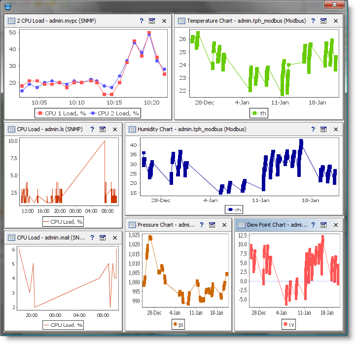
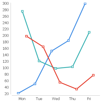
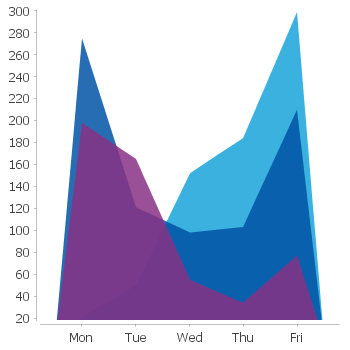
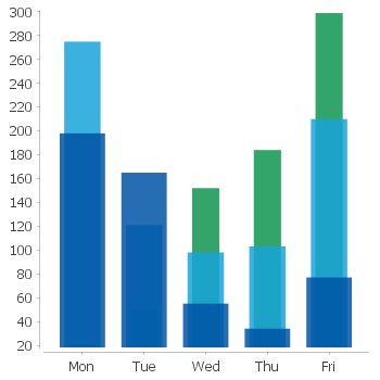
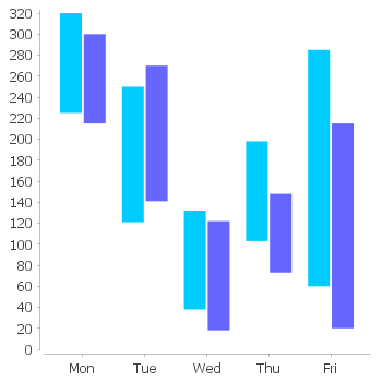
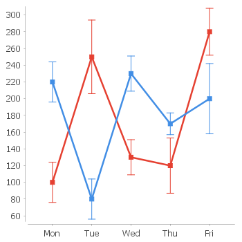
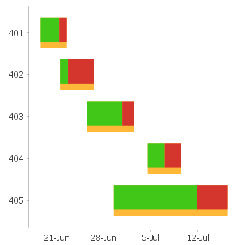
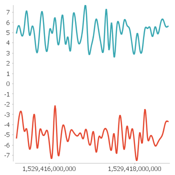
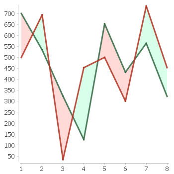
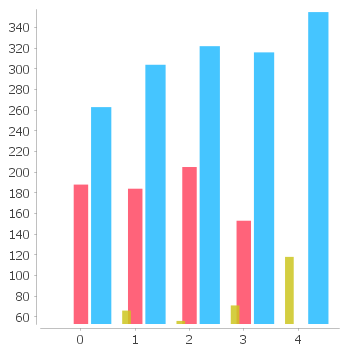
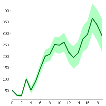
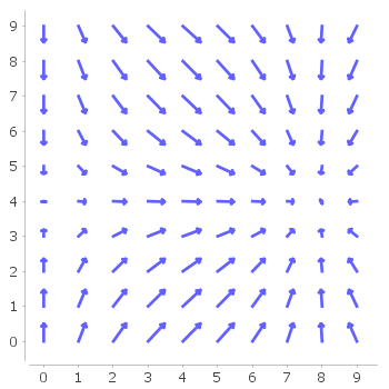
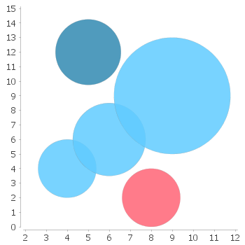
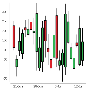
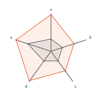
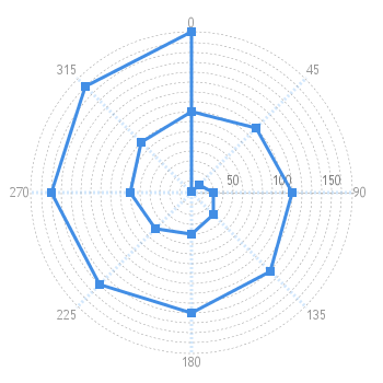
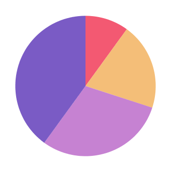
Chart and Diagram Features
Chart components are extremely flexible. Customization capabilities are virtually unlimited:
- Customizable colors, strokes, renderers (line, spline, step, bar, etc.), headers, legends, tooltips, gridlines, crosshairs, range/domain markers, value marks, annotations, and more
- Several data series and axes on one chart
- Configurable time units and ranges for time-based charts
- Combined charts allowing several charts to share a single axis
- Thousands of fine-tuning options
- Real-time mouse zooming, panning, and guideline creation
- Context menu for fine-tuning, printing and exporting