Widgets and GUI Builder
A widget is a special "sub-application" with a graphical user interface (GUI) consisting of the user interface components, such as text fields, tabbed panels, video windows, etc.
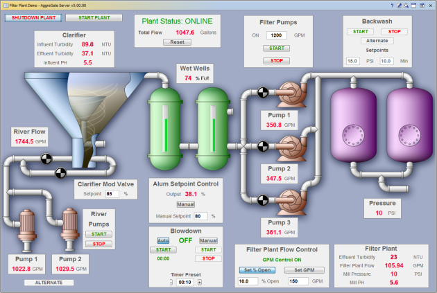
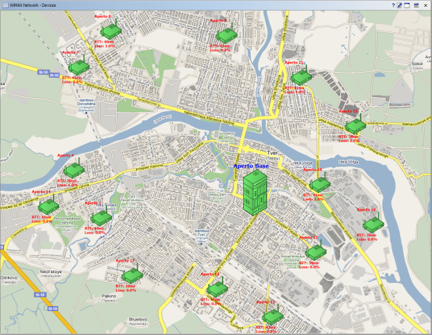
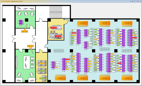
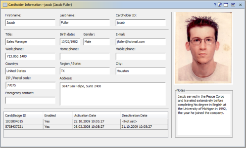
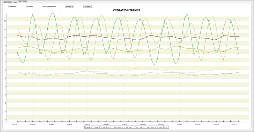
Widgets are good for building forms, charts and diagrams, facility/floor plans, dynamic maps, and human-machine interfaces (HMI). These interfaces can be used to control, configure and monitor different hardware devices or system components.
Widgets can be grouped into a dashboard to act as a custom operator interface.
Widget components are tied to the server and device data using data bindings which can also link the components together and define different expression-based data conversion patterns. Bindings can be activated:
| During the widget startup |
| Upon the server-side event or state change, e.g. when the new device data arrives |
| Upon the widget component event or state change, e.g. button click |
| Periodically |
Java scripts can be inserted into a widget if a data processing task cannot be performed using expressions.
Widgets may include many different components:
- Text and Password Fields
- Text and HTML Areas
- Buttons and Toggle Buttons
- Combo Boxes
- Lists
- Check Boxes and Radio Buttons
- Sliders and Spinners
- Date and Time Pickers
- Progress Bars
- Tables
- Raster Images
- Dynamic Vector Drawings
- Charts
- Event Logs
- System Trees
- Gauges, Meters and LED Displays
- Video Players
- Topology Graphs
- Dynamic Maps (roadmap/terrain/satellite)
These components may be grouped in various containers:
- Panels
- Tabbed Panels
- Split Panels
- Layered Panels
- Subwidgets
- Popup Menus
The containers support two layouts:
- Grid layout that auto-aligns the components according to their size. It is especially good for building forms.
- Absolute layout with the strictly defined component positions and sizes. This layout is useful for building the HMI-style custom screens, maps, plans, etc.
The containers with different layouts can be combined within one widget to build complex interfaces.
Widget UI components have thousands of editable properties. Some of them are shared between several component types, the other ones are component-specific. The common properties include visibility, sizes, borders, fonts, colors, strokes, cursors, tooltips, focus properties, and more.
UI Builder
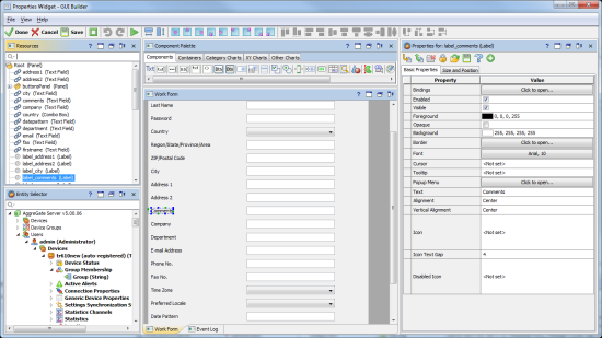
Widgets are created in the interactive UI Builder application which is a part of the AggreGate Client and Unified Console. It’s a visual editor for all widget types. It doesn't require any programming knowledge and lets you easily:
- Add, move and resize the components via drag and drop
- Visually edit the widget layout and layouts of individual containers
- Bind the server data to widget components
- Edit the component properties and data bindings
A widget can be launched for testing at any time directly from the GUI Builder. Even in test mode, the widgets can operate with the real server and device data.
